The days are gone when the companies design a website for a single desktop screen. With the advancement of technology and the expansion of mobile responsive websites, web designers are driven to re-think their work to display across multiple devices? Have you ever thought, how much browsing you carry out daily on your smartphones and desktop? Of course, your answer will be on phones.
That’s the reason, mobile responsive websites are more important than ever for any business. Today there are almost 2.6 billion smartphone users and will be tipped to reach above 6 billion by 2020. However, responsive designs do not make consistency in the mobile experience. It is also influenced by the manner and tactics we design for all screens, simpler layout, and more streamlined experiences.
In general, we can say that Responsive Web Design is a technique that lets design as well as code to respond size of the device screen. No matter whether you use 4-inch Android mobile or iPad or 40 inches LED display, you will get an optimal viewing experience. The best responsive website designs make use of fluid grids, CSS and highly optimized images to change the site design based on the width of browsers. Designers need to customize the UX and UI of website design among various devices and platforms.
Weird out about designing for the Web? Don’t be stressed, it’s a continuous fight for everybody in the industry to adapt the design for every browser version and hardware device.
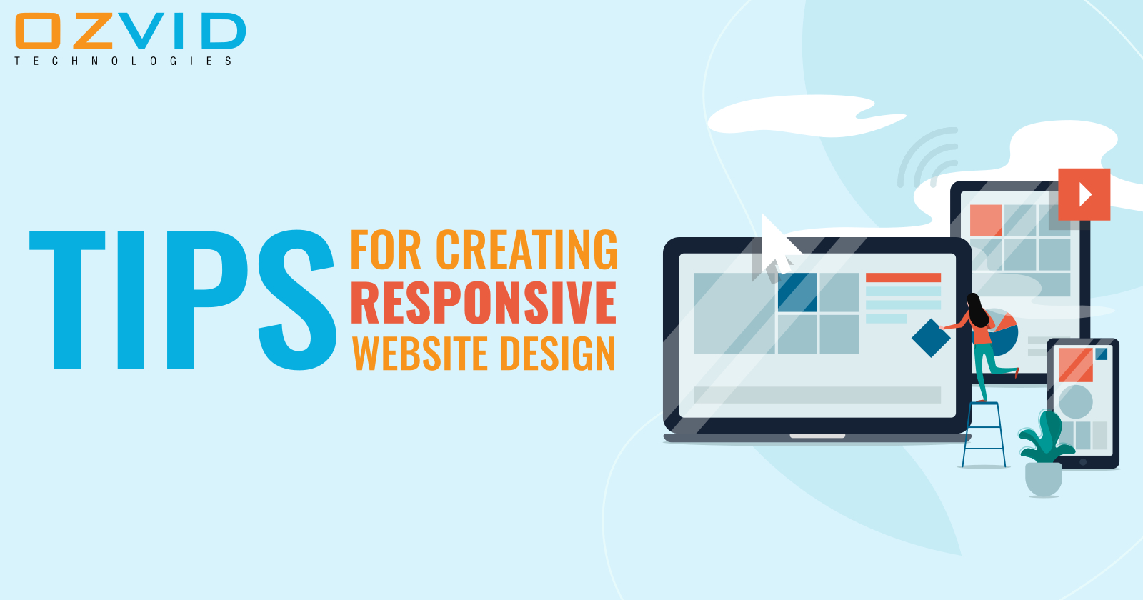
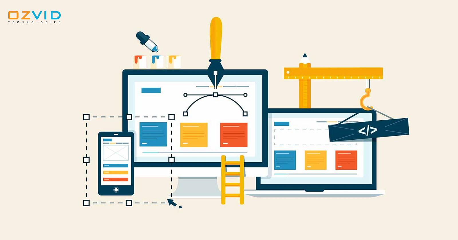
Here we are going to round-up some tips that will help you to make your website look great and work well on any device.1. Think & Plan your design
Take the planning as your priority and find out how your website will look. By doing so, you will able to customize your templates and integrate them with your brand. That’s why you need to plan the design layout first. You must create a wireframe, next visualize your design before coding.
Some of the Prototyping Tools that you can use to create responsive Prototypes are as follows-
- Adobe Edge Reflow- Convert photoshop file into HTML and CSS, then permits you to adjust the design by mobile breakpoints.
- Wirefly- Let you employ a mobile responsive grid and form a wireframe of your website. No need to calculate widths and percentages manually.
- InVision- Here you can check how your site would appear in several contexts.
2. Concentrate On Your Navigation
Navigation plays an important role in responsive designs. You can simplify and ease your navigation options by using icons paired with text, collapsible menus, dropdowns, hamburger style menus so that people can get easily where they want to move. It is concluded that you have room for four to five core links that affect site navigation and complete content strategy.
3. Highly Optimize Images
While creating a responsive design layout, make sure to create an optimized image to look at your website look concentrate On Your Navigation attractive. You may use JPEG, PNG-8, and GIF file formats, the logo with a transparent background and avoid using PNG as it decreases your website speed by 5 to 10 times. This, in turn, helps visitors to visualize your products and your website will get a load on mobile devices quickly.
4. Native Functionality
Let’s hear talk about Instagram as an illustration. This application has a web version but the target audience mostly uses a mobile app. But Why? The Instagram mobile app utilizes geolocation, phone camera, contacts and gives users quick access. Similarly, if your product needs native functionality of smartphones, then a mobile application is what you demand. As a result, it can wind up with more profit rather than developing a responsive website design for a single website.
5. Never outlook on responsive typography
Typography is the foundation of any website design. If you want to make your content appear effective in mobile devices, font sizes must be optimized following them. You must use pixels to define the font size for a responsive site. Ensure to design at least three versions for different browser width like 600px, 600-900px and 900px+. Between these, your content will get freely scale and provider better experience. Take CSS3 specifications in account as the unit called rems that are associated with the HTML elements. This will help to adjust the complete webpage dynamically based on the viewport width of the browser.
Point to Remember- Never uses decorative or script fonts for body content or menus as they are difficult to read on small screens.
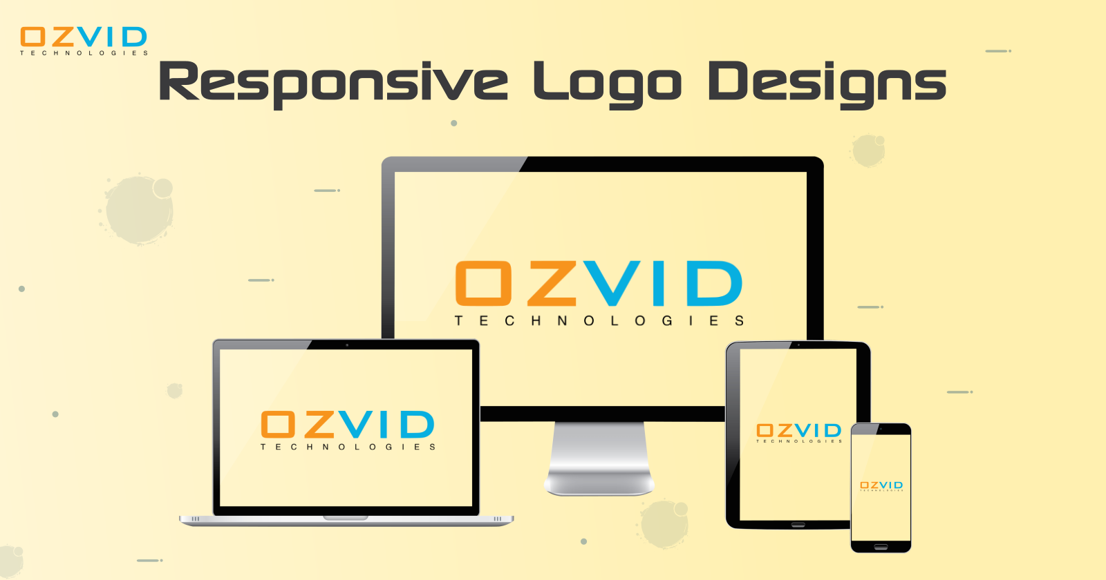
Mobile responsive website
- Test code Snippets
- Advanced Google Design Standards and Updates
- Parallax Scrolling
- Media Queries
- Limited Content for Customer Engagement
The Final Words
Creating a web design is not just about pretty layouts. It’s regarding understanding the trending market challenges for your business development. Here your performance is everything, so make use of the above-discussed tips that will contribute to websites for loading fast and performing well in the hands of the customer.
So if you want to invest in a responsive website, you are most welcome to contact OZVID Technologies to get high-quality services with cutting-edge technologies and thus, make your website user-friendly.


Share this post on: