
- Aug 04, 2026
- Web Design
- 12
Share this post on:
Key Takeaways
- Responsive web design adapts websites to different screen sizes, ensuring consistent user experiences across desktops, tablets, and smartphones.
- Mobile-friendly websites improve SEO performance, helping businesses achieve better search rankings, increased traffic, and higher visibility.
- A single responsive website reduces development and maintenance costs compared to managing separate desktop and mobile websites.
- Fast loading speeds, flexible layouts, and intuitive navigation significantly improve user engagement and increase conversion rates.
- Modern responsive websites are built using flexible grids, scalable images, media queries, and mobile-first design principles to ensure long-term scalability.
We live in digital-first world where a business website serves as the foundation of its online presence. Whether customers are browsing products, booking services, or contacting a company, they expect a seamless experience regardless of the device they use. With smartphones, tablets, laptops, desktops, and even smart TVs becoming common browsing platforms, businesses can no longer rely on websites designed for a single screen size. This is where Responsive Web Design (RWD) becomes essential.
Responsive web design is a modern web development approach that enables a website to automatically adjust its layout, images, navigation, and content according to the screen size and device capabilities. Instead of creating separate websites for desktop and mobile users, businesses can maintain a single website that delivers an optimized experience across all devices.
Beyond user satisfaction, responsive web design plays a crucial role in search engine optimization (SEO). Search engines prioritize mobile-friendly websites because they provide better experiences for users. Businesses with responsive websites often achieve improved search rankings, lower bounce rates, and higher conversion rates. A responsive website also simplifies content management since updates only need to be made once rather than across multiple versions of a site.
As technology continues to evolve, businesses must invest in websites that remain flexible and future-ready. Responsive web design supports new devices, emerging screen resolutions, and changing user expectations without requiring a complete redesign every few years.
In this comprehensive guide, you'll learn the core principles of responsive web design, explore its business benefits, understand the development costs involved, discover the factors influencing project pricing, and review industry best practices for building modern, scalable, and high-performing websites.
Core Principles of Responsive Web Design for Modern Businesses
Responsive web design is built on several foundational principles that work together to create websites capable of delivering excellent user experiences on every device. Understanding these principles helps businesses make informed decisions during website development while ensuring long-term performance, accessibility, and scalability.
1. Flexible Grid Layouts
A flexible grid system forms the backbone of responsive web design. Instead of fixed-width layouts, developers use percentage-based columns and relative units to allow page elements to resize dynamically according to the user's screen dimensions. This approach ensures that text, images, and content sections maintain proper alignment without causing horizontal scrolling or broken layouts. Flexible grids also simplify future design updates and support a consistent visual hierarchy across different devices.
2. Fluid Images and Media
Responsive websites use images, videos, and other media that automatically resize within their parent containers. Instead of overflowing or appearing distorted, media elements adjust smoothly based on screen size while preserving quality. Developers also implement modern image optimization techniques, including responsive image formats and lazy loading, to improve website performance without compromising visual appeal.
3. Mobile-First Design Strategy
Modern responsive websites are increasingly developed using a mobile-first approach. Designers begin with layouts optimized for smaller screens before progressively enhancing the interface for tablets and desktops.
This strategy encourages developers to prioritize essential content, simplify navigation, and optimize performance from the beginning rather than treating mobile users as an afterthought.
4. CSS Media Queries
Media queries enable websites to apply different styles depending on screen width, orientation, resolution, and device capabilities. They allow layouts to reorganize automatically without requiring separate website versions. Developers can adjust typography, navigation menus, spacing, image sizes, and content placement to provide users with the most comfortable viewing experience across all devices.
5. Responsive Typography
Typography plays a significant role in readability. Responsive websites use scalable font sizes, line heights, and spacing that adjust according to screen dimensions. Well-designed typography ensures visitors can comfortably read content without zooming, regardless of whether they're using a smartphone or a large desktop monitor.
Business Benefits of Responsive Web Design That Drive Growth
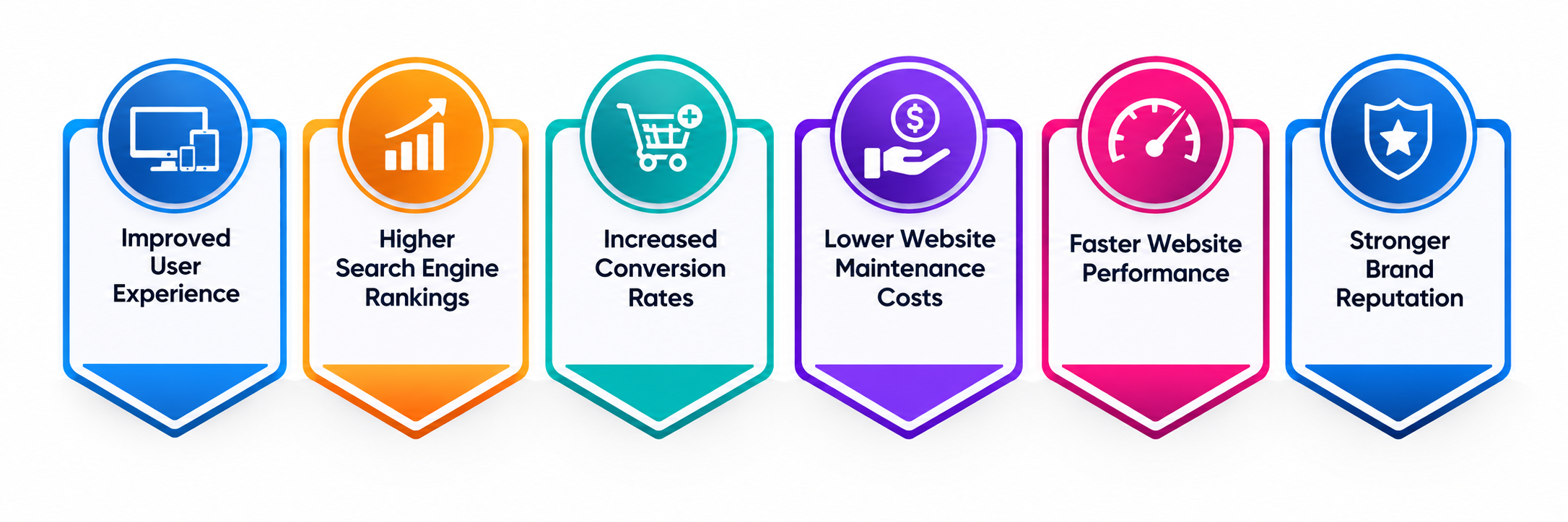
Responsive web design is more than a technical requirement, it is a strategic business investment. A responsive website improves customer satisfaction, enhances brand credibility, increases search visibility, and supports long-term digital growth. Businesses that prioritize responsive design can attract more visitors, convert leads more effectively, and maintain a competitive edge in an increasingly mobile-first marketplace.
1. Improved User Experience
A responsive website delivers a consistent browsing experience regardless of whether users access it from a smartphone, tablet, laptop, or desktop. Navigation, content, images, and interactive elements automatically adapt to different screen sizes, making it easier for visitors to explore the website and complete desired actions.
- Delivers seamless browsing across devices
- Increases customer satisfaction
- Reduces website abandonment
- Encourages longer browsing sessions
2. Higher Search Engine Rankings
Search engines prioritize websites that provide excellent mobile experiences. Responsive web design eliminates duplicate content issues associated with separate desktop and mobile websites while improving page usability and loading performance. A mobile-friendly website has a greater chance of ranking higher in search engine results, helping businesses attract more organic traffic.
- Improves mobile SEO performance
- Increases organic website traffic
- Enhances search visibility
- Supports long-term digital marketing
3. Increased Conversion Rates
A responsive website removes barriers that often prevent users from completing purchases, submitting inquiries, or requesting services. Easy navigation, readable content, and optimized forms contribute to a smoother customer journey from discovery to conversion. Whether visitors are purchasing products, scheduling appointments, or filling out contact forms, responsive design helps create frictionless experiences that encourage action and improve overall conversion rates.
- Generates more sales opportunities
- Simplifies customer interactions
- Improves lead generation
- Maximizes marketing ROI
4. Lower Website Maintenance Costs
Managing separate desktop and mobile websites requires additional development time, maintenance efforts, testing, and content updates. Responsive web design eliminates these challenges by allowing businesses to maintain a single website for all devices. A unified website simplifies updates, reduces operational expenses, and ensures consistent branding across every platform, making website management significantly more efficient.
- Reduces maintenance expenses
- Simplifies content management
- Eliminates duplicate work
- Saves development time
5. Faster Website Performance
Modern responsive websites are built with optimized images, efficient coding practices, browser caching, and performance-enhancing technologies. These improvements help pages load quickly across different devices and network conditions. Faster websites improve customer satisfaction while reducing bounce rates. Website speed also contributes to stronger search engine rankings and better conversion performance.
- Improves page loading speed
- Enhances customer experience
- Reduces bounce rates
- Supports SEO performance
6. Stronger Brand Reputation
Customers associate website quality with business professionalism. A responsive website demonstrates that a company values customer convenience and invests in modern digital experiences. Consistent branding, polished layouts, and reliable functionality create positive first impressions that build trust among potential customers and business partners.
- Builds customer confidence
- Enhances professional image
- Strengthens brand identity
- Improves customer loyalty
How Much Does Responsive Web Design Cost?
The cost of responsive web design depends on multiple factors, including website size, design complexity, required functionality, third-party integrations, and customization needs. While basic responsive websites can be developed within a modest budget, enterprise-level platforms with advanced features require significantly larger investments.
Businesses should consider responsive web design as a long-term investment rather than a one-time expense. A professionally designed responsive website improves customer experience, boosts search rankings, increases conversions, and reduces future maintenance costs, delivering substantial returns over time. Below is an estimated pricing guide for different types of responsive web design projects.
Website Type | Estimated Cost (USD) | Suitable For |
Basic Business Website (5–10 Pages) | $1,000 – $3,000 | Small businesses and startups |
Professional Corporate Website | $3,000 – $8,000 | Growing companies |
Custom Business Website | $8,000 – $20,000 | Medium-sized enterprises |
eCommerce Responsive Website | $10,000 – $40,000+ | Online stores |
Enterprise Web Portal | $25,000 – $100,000+ | Large organizations |
SaaS Platform Interface | $30,000 – $150,000+ | Software companies |
Responsive Website Redesign | $2,500 – $15,000 | Existing business websites |
Key Factors That Influence Responsive Web Design Costs
The overall cost of responsive web design depends on several technical and business considerations. Understanding these factors enables organizations to plan budgets effectively while selecting the right development partner for their digital transformation goals.
1. Website Size and Number of Pages
The number of pages significantly impacts development time. Larger websites require more layouts, responsive testing, navigation structures, and content optimization across different screen sizes. Complex websites containing blogs, service pages, landing pages, knowledge bases, and customer portals naturally require additional development resources compared to smaller informational websites.
2. UI/UX Design Complexity
Highly customized user interfaces involve extensive research, wireframing, prototyping, animations, branding, and interactive components. Businesses seeking premium user experiences should expect higher development investments. Simple template-based websites cost considerably less but offer limited flexibility and uniqueness.
3. Custom Features and Functionality
Advanced functionality such as customer dashboards, appointment booking, payment gateways, CRM integration, chat systems, multilingual support, AI-powered tools, and personalized experiences increases development complexity. Also, each additional feature requires planning, coding, testing, and maintenance.
4. Technology Stack
The chosen development technologies influence project pricing. Websites built using modern JavaScript frameworks, headless CMS architectures, or enterprise platforms typically require specialized developers and additional implementation time. Futher, technology choices also affect scalability, security, and future maintenance requirements.
5. Content Management System
Businesses often choose CMS platforms such as WordPress, Drupal, Joomla, or custom-built content management systems. Custom CMS solutions generally involve higher upfront costs but provide greater flexibility and security. The CMS selection also determines future content management efficiency.
Best Practices for Building a High-Performing Responsive Website
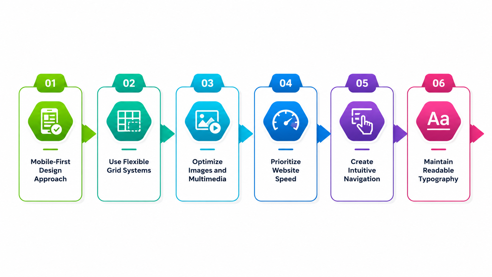
Responsive web design is most effective when it follows industry best practices that prioritize usability, speed, accessibility, and scalability. By implementing these proven strategies, businesses can create websites that deliver exceptional user experiences, improve search engine visibility, and remain adaptable to future technological advancements. Following these best practices also helps maximize return on investment while minimizing maintenance challenges.
1. Mobile-First Design Approach
A mobile-first strategy begins the design process by focusing on smaller screens before expanding layouts for tablets and desktops. Since a large percentage of users browse websites on smartphones, designing for mobile first ensures essential content, navigation, and functionality remain accessible and user-friendly. This approach encourages developers to prioritize performance, simplify interfaces, and eliminate unnecessary elements that could slow down the website.
2. Use Flexible Grid Systems
Flexible grid layouts enable website components to resize proportionally according to different screen sizes. Instead of relying on fixed-width elements, developers use relative units such as percentages and CSS Grid or Flexbox to create adaptable page structures. These grids ensure consistent alignment, spacing, and visual hierarchy across devices, reducing layout issues while making websites easier to maintain as new screen resolutions emerge.
3. Optimize Images and Multimedia
Images and multimedia often account for the largest portion of a webpage's size. Optimizing these assets through compression, responsive image formats, lazy loading, and adaptive scaling significantly improves loading speed without sacrificing visual quality. Efficient media optimization enhances user experience, reduces bandwidth consumption, and contributes positively to search engine rankings by improving Core Web Vitals.
4. Prioritize Website Speed
Website performance directly impacts user engagement and conversion rates. Businesses should minimize CSS and JavaScript files, enable browser caching, use Content Delivery Networks (CDNs), and optimize server responses to reduce loading times. Fast-loading websites improve customer satisfaction, lower bounce rates, and increase the likelihood of users completing purchases, inquiries, or other desired actions.
5. Create Intuitive Navigation
Navigation should remain simple and consistent across all devices. Responsive websites often incorporate collapsible menus, sticky headers, clearly labeled navigation links, and touch-friendly buttons to improve usability on smaller screens. Well-structured navigation allows users to locate information quickly, reducing frustration while increasing engagement and overall website effectiveness.
6. Maintain Readable Typography
Typography plays a critical role in user experience. Businesses should use responsive font sizes, adequate line spacing, and sufficient contrast to ensure content remains easy to read on every device. Consistent typography strengthens branding while improving accessibility for users with varying visual abilities and different screen sizes.
Conclusion
Responsive web design has become an essential investment for businesses aiming to succeed in today's digital landscape. As users increasingly access websites through a variety of devices, delivering a seamless, fast, and engaging experience is no longer optional, it is a business necessity. A responsive website enhances user satisfaction, strengthens brand credibility, improves search engine rankings, and supports higher conversion rates while reducing long-term maintenance costs.
By understanding the core principles, evaluating development costs, considering the factors that influence pricing, and implementing industry best practices, businesses can build websites that are scalable, future-ready, and capable of adapting to changing technologies and customer expectations.
OZVID Technologies offeres responsive, high-performance leading web design services tailored to your business objectives. Our experienced team combines modern design principles, cutting-edge technologies, and user-centric development practices to create websites that not only look exceptional but also deliver measurable business results. Whether you're launching a new website or modernizing an existing one, OZVID Technologies is your trusted partner for building responsive digital experiences that drive growth, engagement, and long-term success.
Frequently Asked Questions
1. Why is responsive web design important for businesses?
Responsive web design enables businesses to provide a consistent user experience across smartphones, tablets, laptops, and desktops. It improves customer satisfaction, increases search engine visibility, supports higher conversion rates, and reduces maintenance costs by eliminating the need for separate mobile and desktop websites.
- Improves customer experience
- Enhances SEO performance
- Increases conversions
- Reduces maintenance costs
2. How does responsive web design improve SEO?
Search engines prioritize mobile-friendly websites because they offer better usability and performance. Responsive websites use a single URL structure, load efficiently across devices, and reduce duplicate content issues, all of which contribute to stronger search rankings and increased organic traffic.
3. How long does it take to develop a responsive website?
Development timelines depend on project complexity, website size, custom functionality, and design requirements. A basic responsive website may take a few weeks, while enterprise websites with advanced integrations and custom features can require several months.
4. What technologies are commonly used for responsive web design?
Developers typically use HTML5, CSS3, JavaScript, CSS Grid, Flexbox, responsive frameworks such as Bootstrap, and modern front-end libraries like React, Angular, or Vue.js. These technologies help create adaptable, scalable, and high-performing websites.
Common Technologies:
- HTML5 & CSS3
- JavaScript frameworks
- Bootstrap or Tailwind CSS
- CSS Grid & Flexbox
5. Is responsive web design suitable for eCommerce websites?
Yes. Responsive web design is essential for eCommerce businesses because customers frequently shop using mobile devices. A responsive online store improves product browsing, simplifies checkout processes, enhances customer satisfaction, and increases sales opportunities.
6. What factors affect the cost of responsive web design?
The cost depends on website size, custom design, functionality, third-party integrations, CMS selection, content creation, performance optimization, testing, and ongoing maintenance. More advanced websites require greater development effort and higher investment.
Cost Drivers:
- Project scope
- Design customization
- Feature complexity
- Maintenance requirements
7. Why should businesses choose OZVID Technologies for responsive web design?
OZVID Technologies delivers responsive websites that combine exceptional design, high performance, robust security, and scalability. Our team focuses on creating digital experiences that improve customer engagement, strengthen online visibility, and support long-term business growth through tailored web development solutions.
Why Choose OZVID Technologies:
- Experienced development team
- Custom responsive solutions
- SEO and performance focused
- End-to-end support and maintenance