- Mar 30, 2023
- Web Design
- 12659
Share this post on:
Do you know that when the audience visits your website, it is not the content that they read? You might have spent countless hours creating the best content. But it can still be so unread. Well, we are not saying that it does not have value on your website or in your digital marketing strategy. It does.
Most people are visual thinkers. When you look at the design, an image, or a graphic, you can process it faster than what is written on the website. This all narrows down to a central idea, and that is visual hierarchy.
Visual hierarchy is a design principle that defines how elements must be arranged in a design. It decides the organization and prioritization of content as a way to communicate a specific idea, thought, or message.
Also, the design principle helps readers understand what is vital. It is key for creating business communications such as infographics, reports, presentations, and more.
For example, a business card has elements such as a name, organization, contact number, email address, and more. Out of all these elements, which one do you consider the most important? What should a person look at first? Often, this would be the name of the company followed by the person’s name, job title, and contact information.
Implementing a visual hierarchy helps the reader process information and makes it more visually appealing. Moreover, designers must practice proper visual hierarchy to attract and keep the audience on their page or website.
With that said, this article will cover the principles and importance of visual hierarchy.
Different ways to organize visual information
When it comes to visual hierarchy, these are a few things that designers must think about:
- Where should the audience look first?
- What is the most crucial information on this page?
- Where is the best place to keep a call to action?
- What is the best way to keep the audience on the page?
Ultimately, your website design is all about non-verbal communication. Your website design must be able to communicate effectively with your audience. Visual hierarchy guides the eyes of your audience.
Recent studies say that people decide if they want to read the page or not after scanning. And scanning can vary from person to person. The scanning usually takes place in two ways, and these patterns guide designers in arranging page elements to hold the audience’s attention.
F-Pattern: This reading pattern is best if there is a lot of text on the page, including blogs and ebooks. That is because the readers scan down the left side of the page. Then they look for keywords of their interests on the left-aligned side of the page or in the first few topics. If the readers like the left side, they will continue on the right side. The scanning pattern can look like F (or even E).
Are you wondering how to include these designs in your business? Firstly, make sure that you place the most crucial information on the left side. Ensure to use short, bold headlines, bullet points, and other criteria to break up heavy paragraphs.
Z Pattern: The pattern Z will be applicable if there is no block of text available, for example, landing designs and ad creatives. In web landing pages, the eyes of the reader will naturally look across the top of the pages. It happens because sometimes the crucial information is available at the top of the page. Then it is seen that after the top, they go directly to the opposite corner in a diagonal line and start scanning again at the bottom of the page.
So, it is wise to place important information at the top or bottom of the page. And the majority of designers use the same trick for keeping data. Moreover, after placing the information on the top and bottom, designers tend to place information that needs to be read across the top and the bottom in a diagonally connecting line.
Principles of Visual Hierarchy
Here are a few principles of visual hierarchy that every beginner designer must know.
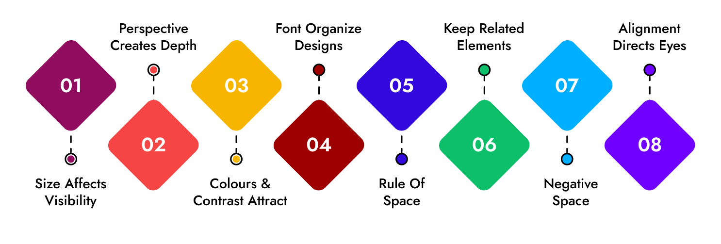
- Size affects visibility: Bigger the size, the better the visibility. The size is one of the most effective ways to emphasize the visual elements. Larger elements usually draw more attention than smaller elements. It is another reason why newspaper headlines are of larger fonts than major stories. Larger sizes or fonts grab the attention directly hence it is wise to write the crucial information in larger fonts.
- Perspective creates depth: Perspective helps designers create an illusion of depth that ranges from a few inches to several miles. You can see the same illusions in the real world. We tend to perceive objects which are closer as larger. Similarly, a drawing of a five-mile stretch of road looks sharper than a half-mile stretch when drawn on the same size canvas.
- Colors and contrast attract: Color plays a vital role when choosing designs. Bright colors are more attractive than dull colors. For example, a highlighted text grabs the immediate attention of the reader. Moreover, dramatically contrasting colors can also emphasize specific elements. For example, placing a red object on a green or black background will draw more attention than the same red object on an orange or purple. The color combinations used in designs are known as the color scheme.
- Fonts organize designs: Fonts emphasize what is crucial and organize the overall designs of the document. Fonts are quite powerful. Even if you use the same font with different sizes, it grabs attention and is easy to read and understand. Likewise, design having a series of elements that are all in the same font, grabs the least attention. With that, it will look clumsy and hard to read or understand.
- Rule of space: One of the most basic rules is the rule of space. According to the rule, a pleasing design requires a clutter-free negative space often refer as white space. Designers must use the space around the content when arranging the elements of composition. Strategic spacing draws the observer's attention across the page in a targeted sequence.
- Keep related elements: The rule is that when the elements appear concerning one another, it is considered one of the most basic compositions. And these elements must be placed close together. Moreover, placing elements together can send other messages as well. Also, by placing elements within a particular proximity of each other, added images, and messages can be created.
- Negative space: Negative space makes information easier and helps the reader to remember by grouping it into compartments. Moreover, it also creates a focus of the user on individual items. If the designs lack negative space, they can look confusing and chaotic design. Additionally, you can utilize blank space to display additional visual messages.
- Alignment directs eyes: Alignment is part of the design structure. It focuses on visual components, whether text or images.
For example, if the text is left aligned, then the object shares a left margin. When visual designs are centered and aligned, it means that they share both left and right margins. Also, it is seen that in F-pattern designs, objects are aligned to the left, and in Z-pattern, the objects are the combination of left, center, and right alignments.
Most readers read from the left to right side of a page, so the alignment is done accordingly. Right alignments are often employed to provide a balance to an overall design. Whereas left alignments can offer the same but in the reverse scenario.
How to create a visual hierarchy?
Here are a few tips and tricks to help you create a strong, visually appealing hierarchy that will help your business grow.
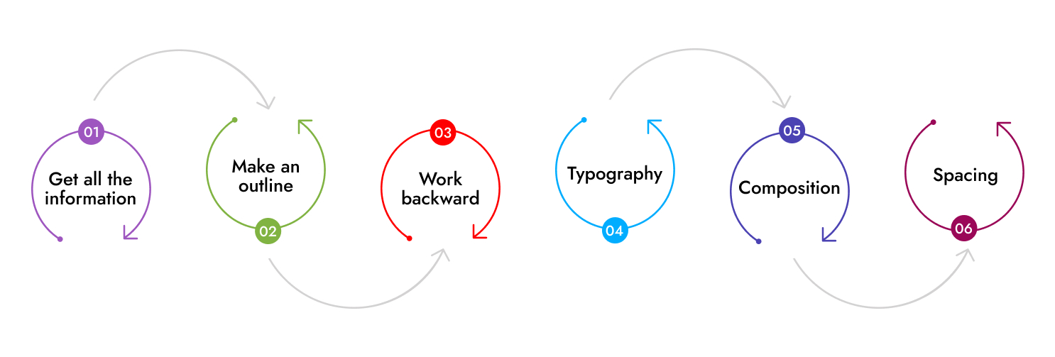
- Get all the information: Ensure that you have a strong handle on the text and visuals before you start a design. Know what design you want and what text you want to display. Late addition can create lots of problems and chaos in your designs and hierarchy. Moreover adding text late needs to shift everything around to fix new text or visuals.
- Outline: Just like students jot down a quick outline of their lecture or class lesson, including numbered sections and subsections. Designers are suggested to do the same. This will not only help you grasp the content but will help you understand certain elements that can help you design better. You can make a note of this and apply it to your designs.
- Work backward: Working backward means starting the work with a small piece of content and then moving towards the largest one. Once the content is decided you can use the work backward techniques to get better results. Moreover, do not do it with every word on the page, but take a few elements, such as the main title, section header, subheading, and body text and work with them. Additionally, try to play around with colors, sizes, and more to find out the best way to make your information clear.
- Typography: When using text, ensure that the largest text is at the top, and crucial text must be covered in the heading. Moreover, use smaller subheadings for supporting information. The body copy size must be smaller than the heading and subheadings. Small changes matter the most, for example, Bold and Italic fonts play a great role in impacting visual hierarchy. Many other fonts fit the brand or product and are more visually appealing and easy to read.
- Composition: To create focal points, designers use many compositional techniques. These techniques include the rule of thirds and the rule of odds, which allows the focal point to be off-center and create an odd number of objects.
- Spacing: Spacing includes white space or negative space in the designs. Ensure that there is a proper space to travel between focal points. For example, white space does not necessarily have to be white. To make stand out, give blank space around separate designs.
What are the best practices to ensure visual hierarchy in design?
Here are a few things that you must remember as best practices for visual hierarchy in the design. These techniques can help you create a better experience for your audience.
- The users must be able to see elements easily in the mobile UX designs and should be able to navigate through the website without any chaos.
- Designers must stay aware while choosing fonts and typefaces. Sometimes, the font that applies to one industry may not apply to another.
- Understand your users and their priorities, so that you can guide the users with important information.
- Remember your end goal associated with each design, and ensure that you tell your designer.
Closing thoughts
“When the power of visual hierarchy meets great designing sense, wonders happen”
Visual hierarchy helps you communicate your brand's story, message, and value proposition. It also prevents you from sending mixed messages to your audience and creates a lot of chaos. A designer’s top priority is to create a space where your audience and brand can communicate non-verbally. Moreover, to apply a visual hierarchy to your design, you must understand your audience and get a firm grasp on these concepts.
If you are looking to build a website using visual hierarchy to tell a cohesive brand story to grow your business, then OZVID is the best choice for you.
OZVID Technologies has a perfect team of web designers and developers who are well-versed with the latest technologies and implement visual hierarchy to create the website.
Our professionals have helped many customers across the globe by designing UI/UX designs that attract more and more audiences. Feel free to contact us and leverage our expertise.